Turn a quarterly earnings release into a one-page graphic
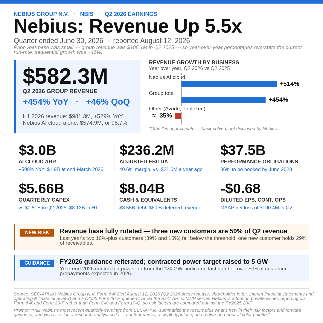
Extracts headline figures, segment growth, the newest risk factor and forward guidance from a company's most recent earnings release, then renders a 1080 by 1080 graphic: one hero metric, a segment chart, six supporting tiles and two callouts. The prompt carries the full visual template, so the layout is identical across companies and quarters.
Prompt
Copy and paste into your assistant
Pull Nebius most recent quarterly earnings from SEC-API.io (their latest 8-K, Item 2.02 press release exhibit) and build me a single square (1080×1080px) graphic, summarizing the results plus what's new in their risk factors and forward guidance. Tell me which filings you used.

Follow this exact visual template:

**Format:** Square, 1080×1080px (10.8×10.8in at 100dpi). White background. A solid blue accent bar (#1f6fd6) across the very top, ~12px tall.

**Font:** Arial throughout (or a metric-compatible equivalent like Liberation Sans if Arial isn't available) — one typeface for the whole graphic, varying only by size/weight/color, never mixing fonts.

**Color palette (use only these):**

- Blue (primary accent, links, guidance callout): `#1f6fd6`
- Dark near-black (headlines, big numbers): `#111111`
- Medium gray (subtitle, tile labels): `#555555` / `#333333`
- Light gray (source line, dividers): `#888888` / `#dddddd`
- Light blue tint (hero stat background): `#eef4fd`
- Amber (new-risk callout): border/chip `#b45309`, background `#fff7ed`
- Red (only if a segment is declining, for a diverging bar): `#c0392b`

**Section order, top to bottom:**

1. Eyebrow line (small caps-style, bold, blue): `COMPANY NAME  ·  TICKER  ·  [PERIOD] EARNINGS`
2. Headline (large, bold, black): `Company: [short punchy 2-4 word takeaway]` — e.g. "Record Profits," "AI Orders Surge." Keep it factual, not hype.
3. Subtitle (gray, regular): "Quarter [and fiscal year] ended [date]"
4. One italic gray footnote line _only if needed_ — e.g. explaining an off-calendar fiscal year, or explaining why a YoY comparison looks extreme due to a prior-year base effect. Skip this line if it doesn't apply.
5. A two-column row: on the left, a light-blue hero stat card with a blue left accent stripe containing the single biggest headline number (large bold), its label, its YoY or QoQ change (in blue), and a secondary total line below in gray. On the right, a horizontal bar chart of segment/product growth (whichever cut — YoY or QoQ — is more meaningful given the numbers; note which one you used in the chart title). If any segment is negative, use a proper zero-anchored diverging bar (not just a shorter bar), with declines in red.
6. A 3-column × 2-row grid of six supporting stat tiles, each with a thin left divider line, a big bold number on top, a bold label below it, and a blue sub-note (context or comparison) at the bottom.
7. Two full-width callout bars, stacked: an amber "NEW RISK" bar summarizing the single most notable new/changed item from the latest 10-Q's Item 1A (compared against the prior 10-K), and a blue "GUIDANCE" bar summarizing forward guidance. Each has a small colored pill/chip label on the left and one bold line of text.
8. A thin gray divider rule, then two small italic gray footer lines: a Source line citing the specific filings used (e.g. "Source: SEC-API.io | [Company] Form 8-K (Item 2.02) and Form 10-Q, queried live via the SEC-API.io MCP server"), and a Prompt line quoting the request that generated the graphic, ending with the same styling instruction: _"...and visualize it in a research-analyst style — content-dense, a single typeface, and a blue-and-neutral color palette."_

**Density rules:** No wasted white space — fit content snugly, then adjust the canvas height (not the margins) until there's only a small buffer (~0.1–0.3in) below the footer. Numbers and labels should be large enough to read at LinkedIn feed size, but the whole thing should read as dense and information-rich, not sparse. No stray colors outside the palette above, no decorative icons, no drop shadows — flat, plain, research-report aesthetic.
Output
When to use this prompt
- Publishing a quarterly recap where the format has to stay identical across companies and quarters.
- Summarising a company you do not follow closely without reading the full release.
- Turning a filing into something a non-analyst audience will read.
What you get back
- A 1080 by 1080 graphic with one hero metric, a segment growth chart, six supporting tiles, and callouts for the newest risk factor and forward guidance.
- A source line naming the exact filings used, so every number on the graphic can be traced back to EDGAR.
- The assistant adapts to the filer. Nebius reports as a foreign private issuer, so it used Form 6-K and Form 20-F instead of the Form 8-K and Form 10-K the prompt asks for, and said so.
Variations
- Change the company. Nothing in the template is specific to Nebius.
- Change the canvas to 1200 by 628 for a link preview, or 1920 by 1080 for a slide.
- Ask for two consecutive quarters side by side instead of one.
- Drop the visual template and ask for a plain text summary with the same sections.
Filings used
- Nebius Group N.V. Form 6-K filed August 12, 2026, covering the Q2 2026 press release, shareholder letter and interim financial statements.
- Nebius Group N.V. FY2025 Form 20-F, used as the comparison for risk factors.
Related prompts
Compare CEO pay against shareholder return
Extracts the Pay versus Performance table required by Item 402(v) from each company's DEF 14A, then charts the year-over-year change in CEO compensation actually paid against the change in total shareholder return.
Chart how a fund's largest positions changed last quarter
Compares two consecutive Form 13F filings from the same manager and charts the quarter-over-quarter change in position value, ranked, for the holdings present in both quarters.